t: 801.228.0067 e: unicorn@rowleypress.com

Letterpress Design Tip: Outlining Text

One of the most common problems we come across in the Adobe Illustrator files we get from designers is that they haven’t outlined the fonts. That means that, unless we happen to own the font they used–which is pretty hit and miss given the massive plethora of fonts out there–Illustrator will replace it with some font we do own. Now that’s obviously not what you want after having slaved over your text for hours. So here’s what you can do:

Step 1) Select All (ctrl-a on a PC, command-a on a Mac)

Step 2) Type > Create Outlines

And you’re done! It’s as simple as that.

Here's an A that isn't Outlined

Here’s an A that isn’t Outlined

And here's one that is!

And here’s one that is!


One final tip: Keep a saved version that isn’t outlined for easy editing! You don’t want to have to recreate a block of text you’ve already outlined just to fix a little typo!

Shannon & Daniel: Blind Impressions

There’s something special about every job, and one of our favorite details on this one was the elegant blind impression. A blind impression is when we don’t use any ink on the plate and simply press it in to the paper. Coupled with the sophisticated simplicity of the lovely black lettering, the blind impression is a beautiful addition to this stunning suite. Congratulations, Shannon and Daniel!

Letterpress U: Stereotypes and Onomatopoeia

Imagine you’re a printer in the 1800s. You’re about to print a novel by a best-selling author. You’ve painstakingly set all the type by hand, hundreds of thousands of letters, and now you have to decide how many copies to print. Well, you can only afford to print a small run, but you know it’ll probably be popular, so you’ll sell out and have to print a second edition soon. Which is great, except you don’t have enough type to leave it all set up for that next edition, which means you’d have to set it all again…all those hundreds and thousands of letters would have to be reset and reformatted, which would lose money and time. What’s a printer to do?

Enter the invention of the stereotype. Bet you didn’t know that was a printing word, did you? Broken down into it’s lovely Greek bits, the word stereotype basically means a solid impression. Printers would take the handset type they’d set, make a papier-maché mold of that type, and then pour hot metal into the mold and voila! a single, solid sheet of type all set they way you want it instead of lots and lots of individual letters. Invented by a fellow named William Ged when he was working on printing the Bible at Cambridge in 1725, it didn’t really get popular until the beginning of the 19th century when Charles Stanhope improved the process. With the advent of the stereotype, if you had to reprint a book, you just took out all the stereotypes and printed away! No more resetting the type every time you needed another copy.

So, how did stereotype come to have its current definition and what does all this have to do with onomatopoeia? Today, we use the word stereotype to describe a quality of sameness, to indicate a group of things or people who we perceive (often negatively) to behave or look or live in a similar way. Well, since when you make and use a stereotype, you’re basically making an exact copy of something, the word eventually became a metaphor for an idea that is repeated or copied exactly. Eventually, that metaphor led to its current meaning.

And as far as onomatopoeia goes, the French word for a printing stereotype is cliché. It’s an onomatopoeic word based on the sound of the hot metal hitting the mold. Much like the evolution of the meaning of stereotype, cliché (in English at any rate) now means something that’s been repeated so much that it’s lost its originality. Just another fun and dandy way old print terminology is affecting you every day!

Hailey & Mike: Crimson & Grey

Unusual color schemes are always fun to print, and the vibrant crimson and subtle dove grey really make the contrasting type faces on this invitation pop! We love the way Hailey and Mike’s names are the clear focal point of the design. Design by James Rabdau of the Summit Group, printed on 110# Crane Lettra Pearl with Pantone 199U (red) and Pantone Cool Grey #4 . Congratulations, Hailey and Mike!

Letterpress U: The Bite that Saved Letterpress

Kiss_press

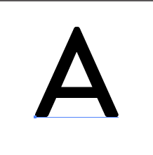
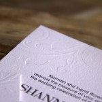
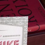
This is what letterpress was supposed to look like; a soft kiss of the ink on the page

This is the first post in a new series called Letterpress University. The series will cover basics on the history of letterpress, how it works, how to design for it, and how we work with our clients and designers. All from our own, rather unique perspective of course… Posts will show up about once a week (or whenever we have the time).

Once upon a time, there was a sleeping princess and a prince and a kiss that saved her and everyone lived happily ever after. But letterpress printing couldn’t be saved by anything as gentle as a kiss. Letterpress required a bite.

People will tell you that letterpress printing is the kind of printing that’s been around since Gutenberg printed his bible. And they’re right. Letterpress was how we humans started mass producing knowledge, and it was a doozy of an invention. It meant all those old monks who spent a lifetime getting just one copy of the Bible or St. Augustine’s Confessions all copied out and illuminated beautifully by hand could now spend that time doing other things, like say gardening and beekeeping, or caring for the sick and needy. But even more importantly, it meant that knowledge could spread and be shared like never before. Just downstairs in our personal library at Rowley Press, we have more books than a king could have acquired in a lifetime before good old letterpress came along. It’s a grand thing and as a devoted bibliophile, I’m extremely grateful for Gutenberg and all that refined the process after him.

Kerri & Steven | Letterpress Wedding Invitations

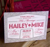
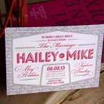
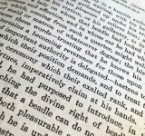
Here’s how letterpress looks now–a nice, deep bite.

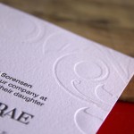
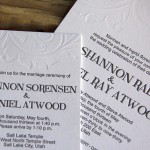
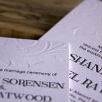
There is, however, a small difference you might notice in a book that was letterpressed 150 years ago or so and that letterpressed wedding announcement you keep adorning your fridge. All you have to do is run your finger across the page and you’ll feel that difference. It’s the difference between a bite and a kiss. The letterpress we all know and love today digs in to specialty paper and creates a tactile work of art that is valued for the deep bite it makes in the paper. A bite that would have made the good men (not many women printers back in the day, I’m afraid) that printed the first editions of Austen and Dickens and Goethe shudder. To them, an impression in the paper was just shoddy craftsmanship–crash printing they called it. The perfectly calibrated machine should be set so the finely inked type would touch the paper with just the lightest “kiss”, leaving the image but no impression behind. (Don’t worry, we’ll do a nice long, cozy post sometime on how this printing process actually manages to kiss and bite paper).

Fast forward to today. What changed? Why do we value and strive for a result that was the enemy of the good printer for hundreds of years? Well, it turns out there are other forms of printing that can “kiss” a piece of paper, or wood or rubber or metal or whatever else takes your fancy, a good deal more gently, efficiently, and clearly than letterpress printing can. Offset, lithography, laser, etc. Starting around the 19th C, letterpress machines were used less and less. By the end of the 20th C, they were all but obsolete. Fortunately for us, in the 1980s, people who liked the feel and craftsmanship of a hand run press started a revival. But they needed something special to set letterpressed work apart, to make it worth the time and effort (and cost) that printing by hand demanded. And thus was the beauty of the bite born.

Now, that’s not the whole story of the revival of letterpress. Lots of fun things helped it along, technologies and design programs and a mention in Martha Stewart Living in the early 90s (how can you not be famous after press like that?). But those are stories for another post, and they would have been meaningless if letterpress couldn’t give you a special product that no one else was. So be grateful for the bite my friends. And remember, sometimes a bite is better than a kiss.