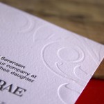
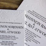
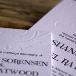
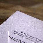
There’s something special about every job, and one of our favorite details on this one was the elegant blind impression. A blind impression is when we don’t use any ink on the plate and simply press it in to the paper. Coupled with the sophisticated simplicity of the lovely black lettering, the blind impression is a beautiful addition to this stunning suite. Congratulations, Shannon and Daniel!
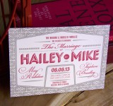
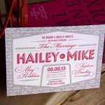
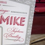
Unusual color schemes are always fun to print, and the vibrant crimson and subtle dove grey really make the contrasting type faces on this invitation pop! We love the way Hailey and Mike’s names are the clear focal point of the design. Design by James Rabdau of the Summit Group, printed on 110# Crane Lettra Pearl with Pantone 199U (red) and Pantone Cool Grey #4 . Congratulations, Hailey and Mike!
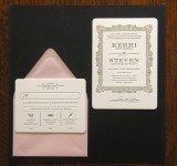
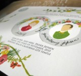
One of our favorite things about this job was the details – not only was it impeccably designed, there were lots of fun details like the pictoral representations of the food available at the reception. The decision to opt for 220# Crane Lettra (rather than the standard 110#) made for beautiful impressions into the paper. We also loved the pairing of gold ink with the antique pink envelope and think that the wedding suite made for a wonderfully classy addition to our portfolio! Congrats Kerri and Steven! Read The Rest
In place of doing long blogposts every once in a blue moon, we’ve opted for the idea of doing many short, portfolio-esque posts (don’t worry, we’ll still throw a few detailed ones in). We wanted to share these beautiful wedding invites with you – designed by the bride herself! Some people have all the talent. Not only did we love printing these, we loved the final touches that the bride and groom chose for them! Happy New Year! Read The Rest
Letterpress & Giclée marry once again for the creation of these wonderful posters designed by the amazing TheHouseThatLarsBuilt! We have worked with Brittany from TheHouseThatLarsBuilt before on her beautiful wedding invitations, so we were excited to work with her on another project. Read The Rest
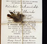
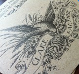
How are we so lucky to work with so many talented clients? Once again, these beautiful wedding invitations were designed by the client and they did an amazing job. They wanted them printed on a brown chipboard to go with the old-world feel of the design. The results—as you can see—were marvelous. Chipboard is a much denser paper than the Crane Lettra that is our standard, so the impression was not as deep as usual, although we added as much packing as we could whilst being careful to preserve the fidelity of the photopolymer plate. These invites are often favorites of people who come in looking for wedding invitations because of the unique paper, character-filled typeface (really, no pun intended), and strong imagery. Read The Rest
One of the limitations of letterpress is that you can only print one color at a time. This means that for each new color, the press must be cleaned, another plate made, the plate for the additional color registered, and all of the sheets of paper hand-pressed all over again. This process must be repeated for each new color. So, for a 3-color wedding invitation with 300 pieces, you actually end up hand-pressing 900 times plus all the additional makeready. This is why you rarely find an invitation with more than 3-colors. Giclée printing is the beautiful answer to this problem. Read The Rest