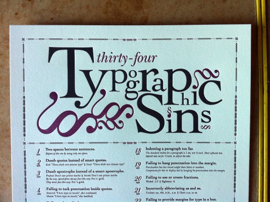
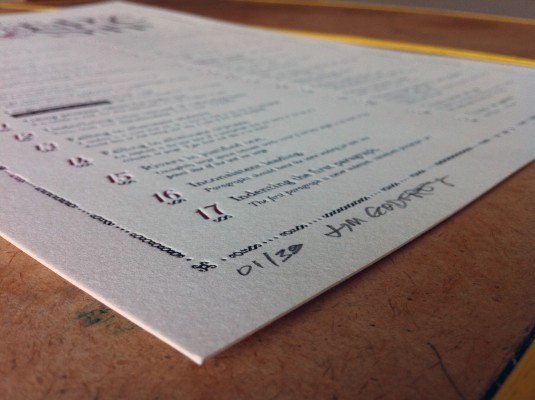
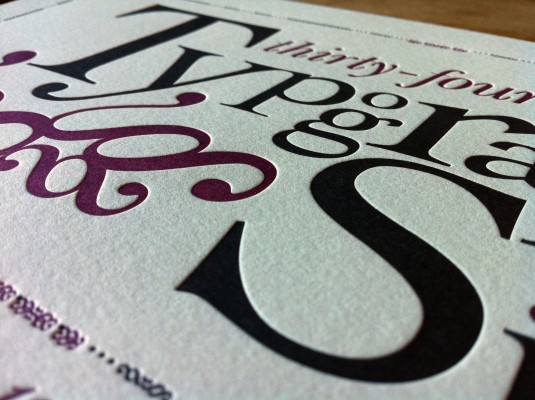
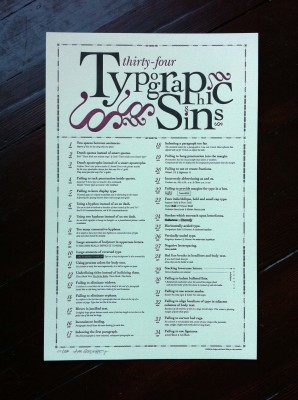
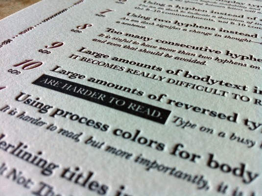
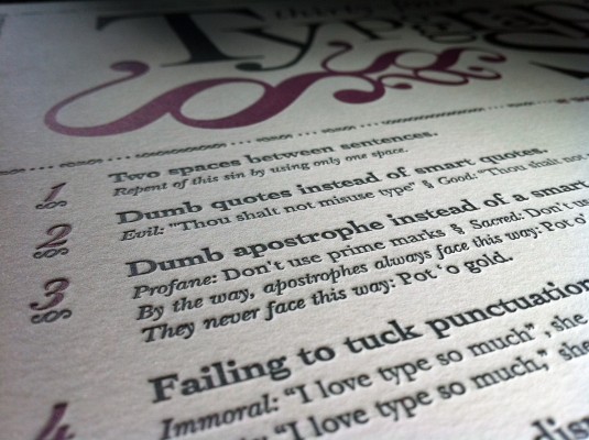
Thou shalt not fail to kern display type. Limited-edition signed letterpress posters expounding the 34 most horrific Typographic Sins known to humankind. Perhaps you need to go see a typographic priest. By Jim Godfrey.
When I printed this poster, traffic to my site more than doubled. I know that typography is a controversial subject, but who knew it would drive traffic like it did? The poster made it to the FPO: For Print Only website where it was exposed to the full scrutiny of a bunch of typographic nerds. The ensuing conversation was quite opinionated, as would be expected. Anytime someone comes out with a definitive stance on a much debated topic discussed by people who take the topic very seriously, you had better hunker down and prepare for the barrage of flack coming from every side. That’s the fun of it, and if anyone can stand his own with these typographic geeks, I would say that Jim Godfrey surely can.
Jim designed the 34 Typographic Sins Letterpress Posters as a means of educating his students on some of the more common mistakes made when designing with type. If you are curious as to the exact content of the poster, you can download a PDF of the poster on Jims’s colleague, Ray Elder’s website. Think of this as typographic missionary work.
These posters presented quite a challenge due to the size mainly. The photopolymer plate extended outside of my print area and took up every last millimeter of vertical printing space that the old Vandercook Sp-15 had in her. The first problem encountered was running our of ink by the end of the impression. There were mixed areas of heavy inking and small text, so you can’t just add more ink to fix the problem because you will lose a crisp edge on your small text. So, we ended up flipping the plate around and double inking the heavy inking areas only.
The next problem came when we were registering the second color. With such a large printing area, the paper actually stretches by the time it gets to the end of the impression. Because one of the plates had lots of printing area and the other had only a few small printing areas, the paper stretched different amounts for each color. This meant that the registration was almost impossible. In the end we ended up modifying the plate to make it work and we ended up with a beautiful product. I am provided with abundant reminders of my saying that letterpress printing is just problem solving.
Any opinions on just how naughty these sins are?



tudza
September 3, 2010 at 12:48 pm //
Two spaces. I take it this person did not take typing and doesn’t understand where this comes from. Or, they’ve gotten totally taken up with style and foisting their own preferences on other people and simply don’t care.
I sentence them to the hell of having nothing but Comic Sans to work with.
Leland
September 3, 2010 at 2:40 pm //
Wow! Quite the harsh sentencing! Hopefully they will be able to use a bit of Papyrus from time-to-time as well.
I would imagine that Mr. Godfrey knows where the two spaces come from, but believes it to be improper usage in the digital age. Would you agree with that?
Josh LaFayette
September 3, 2010 at 3:05 pm //
@tudza
“As a general rule, no more than a single space is required after a period, a colon or any other mark of punctuation.”
from The Elements of Typographic Style by Robert Bringhurst, section 2.1.4
I sentence you to hell.
Bill Owen
September 3, 2010 at 5:21 pm //
This is outstanding, I’m laughing my head off on this one, bravo. By the way, beautiful letterpress.
Andrea
September 4, 2010 at 6:17 am //
Please let me know where there will be a reprint: it’s gorgeous layout wise and content wise — bravo!
Ryan
September 4, 2010 at 3:03 pm //
Even though we learned, in high school typing class, that two spaces should follow the punctuation at the end of a sentence, most fonts are designed such that they only require one space. At least, that’s what my typography-Nazi friends tell me.
Charlotte
September 4, 2010 at 4:03 pm //
Love it! Smart and beautiful…
Cindy
September 4, 2010 at 4:47 pm //
Love it. Wish I could buy it and give it to my secretary sister. She has criticized my design for not using 2 spaces after sentences. Ah, if she only knew the truth…
Robert Bringhurst
September 4, 2010 at 4:47 pm //
@tudza
In the nineteenth century, which was a dark and inflationary age in typography and type design, many compositors were encouraged to stuff extra space between sentences. Generations of twentieth-century typist were then taught to do the same, by hitting the spacebar twice after every period. Your typing as well as your typesetting will benefit from unlearning this quaint victorian habit. As a general rule, no more than a single space is required after a period, a colon or any other mark of punctuation.
PW
September 5, 2010 at 8:43 am //
um… i hate to be a wet blanket here, but in #26, “vertically-scaled type” doesn’t need a hyphen between the words “vertically” and “scaled.” the “ly” already indicates the linkage to the following word.
/writer
Rafe
September 10, 2010 at 6:19 pm //
This is just too good! Thank you!
Amy
November 10, 2010 at 12:07 pm //
This poster looks fabulous! You both did a wonderful job. Jim is an amazing teacher. Everyone could benefit from his knowledge, especially me.
emily
November 18, 2010 at 5:09 pm //
It’s beautiful and useful, and sometimes we all like to sin, but if you reprint, #10 needs a period, and #24 should read ‘Strokes that…’ instead of ‘Strokes which…’
Then please oh please, make this available at a larger digital size so I can show my students!!!
Jim
February 7, 2011 at 7:26 pm //
The period for #10 is on the second line. The entire sentence reads: Large amounts of reversed type are harder to read. You may not have notice that because the text is harder to read
Duly noted on #24.
Bezerkazoid
November 19, 2010 at 2:19 pm //
Kudos! That’s quite an impressive piece of letter press printing. I teach typography at a NYC public college and have taught to avoid most of the same “Sins” myself for quite some time. Lovely piece of printing too! I really do love letterpress. I ran a small press for Saks Fifth Avenue as one of my first jobs. I made the window signs by hand, typesetting with various fonts and pulling proofs that were additionally gilded with gold bevel edges for the window displays. Also set a lot of invites, etc.
also: Typo: Sorry, but I have the “curse” of always seeing errors, especially after 30 years in this business. I can’t believe it took me less that 20 seconds to see it. I read fast! There is an error in your text on this page (not in the work itself) in the sentence: “… was running our of ink by the end …”, I believe the word our should be out.
1. Here are three more for your list, next time: Especially useful in this digital work we do nowadays.
Skewed type: failure to choose a true italic or oblique font.
2. Failure to Letter-space or Track properly for intended use in larger sizes: Especially in larger sizes of most digital fonts or for the specific purpose of the intended use: i.e.: TV lettering (more) or magazine ads (usu less). Never mind additional kerning! Have you ever really tried to read movie credits?!!!
3. Over negatively tracking text type: usually committed by typographic novices in an attempt to loose a widow; not realizing how this will affect the overall “color” and legibility of colliding letter-forms.
Another problem I notice with (digital) fonts these days: Many of the newer OTC fonts have very erratic letter-spacing as a default in their initial set, primarily, I believe, because of their lousy Kerning & Tracking tables, most likely because the novice youngsters producing these fonts have no idea what they are really doing! I can’t believe how staccato they look in display type sizes! Type like this would never fly when it was done by professional typographers!!!
Jim
February 7, 2011 at 7:27 pm //
Great suggestions. Number 3 is already on the poster, it is Sin #27.