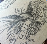
How are we so lucky to work with so many talented clients? Once again, these beautiful wedding invitations were designed by the client and they did an amazing job. They wanted them printed on a brown chipboard to go with the old-world feel of the design. The results—as you can see—were marvelous. Chipboard is a much denser paper than the Crane Lettra that is our standard, so the impression was not as deep as usual, although we added as much packing as we could whilst being careful to preserve the fidelity of the photopolymer plate. These invites are often favorites of people who come in looking for wedding invitations because of the unique paper, character-filled typeface (really, no pun intended), and strong imagery. Read The Rest
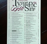
Thou shalt not fail to kern display type. Limited-edition signed letterpress posters expounding the 34 most horrific Typographic Sins known to humankind. Perhaps you need to go see a typographic priest. By Jim Godfrey.
When I printed this poster, traffic to my site more than doubled. I know that typography is a controversial subject, but who knew it would drive traffic like it did? The poster made it to the FPO: For Print Only website where it was exposed to the full scrutiny of a bunch of typographic nerds. The ensuing conversation was quite opinionated, as would be expected. Anytime someone comes out with a definitive stance on a much debated topic discussed by people who take the topic very seriously, you had better hunker down and prepare for the barrage of flack coming from every side. That’s the fun of it, and if anyone can stand his own with these typographic geeks, I would say that Jim Godfrey surely can. Read The Rest
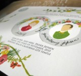
One of the limitations of letterpress is that you can only print one color at a time. This means that for each new color, the press must be cleaned, another plate made, the plate for the additional color registered, and all of the sheets of paper hand-pressed all over again. This process must be repeated for each new color. So, for a 3-color wedding invitation with 300 pieces, you actually end up hand-pressing 900 times plus all the additional makeready. This is why you rarely find an invitation with more than 3-colors. Giclée printing is the beautiful answer to this problem. Read The Rest
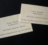
Recently we got to do some special letterpress business cards for the marvelous Portland General Store. We have been fans of PGS for quite some time and have been using their products for all of our manly grooming needs, so doing work for them was like eating a delicious pie or something… They have gentlemanly scents with names like Whiskey and Tobacco, and you can get these rugged scents in old-fashioned shaving soap, cologne, aftershave splash, and more. PGS is known for their simple and well designed labels and packaging that have an old Victorian medicine cabinet flair and they were looking to continue this feel in their business cards. Most of their labels have an aged look that we were trying to achieve on the business cards as well. This aged patina ended up being the hardest, yet most fun, part of the project. Read The Rest


